
New Fire and Smoke Map Is a Valuable Resource for Employers of Outdoor Workers
As part of Cal/OSHA’s wildfire smoke regulation, employers are required to identify harmful exposure to wildfire smoke by checking the Air Quality Index (AQI) for PM2.5. One of the ways they can check the AQI is on the AirNow.gov website.
In addition to the AQI reading on the site, users also have access to the new Fire and Smoke Map, a collaboration from the U.S. Forest Service (USFS) and the U.S. Environmental Protection Agency (EPA). The map provides air quality readings, as well as information on fires, smoke plume locations, and safety recommendations.
The Fire and Smoke Map is a valuable resource for employers of outdoor workers throughout the West because it provides more localized readings, an important feature for rural areas.
Where Does the Data Come From?
The air quality data is collected from permanent government monitors, like those used by AirNow, and also incorporates information from temporary government monitors and low-cost sensors from PurpleAir, that are more widely distributed across the state. In this article from KQED, AirNow sensors are described as “very expensive, state-regulated and regularly calibrated by scientists to accurately measure the density of wildfire ash and other particles in the air. But they are more sparsely located than PurpleAir’s network of hundreds of monitors in the region.”
Before being published, the PurpleAir sensor data undergoes a quality assurance screening by the USFS and EPA. The data is averaged to hourly values and corrected to ensure comparability with established AirNow monitors.
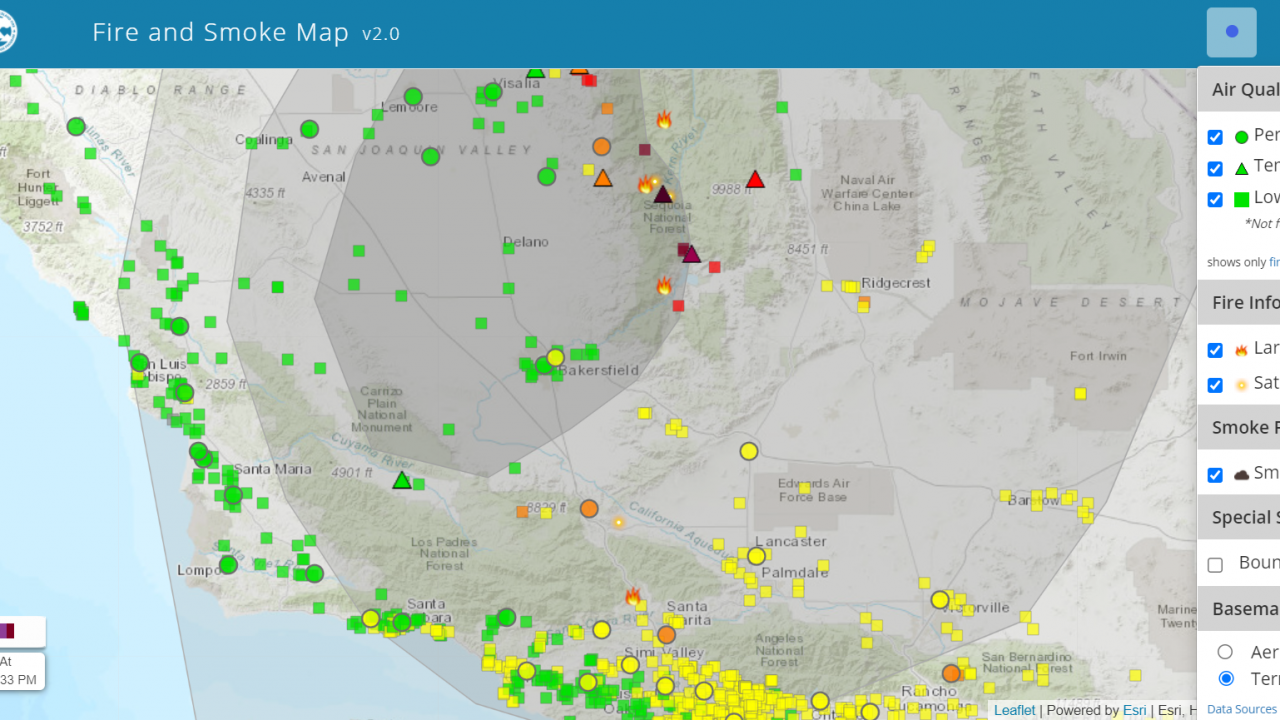
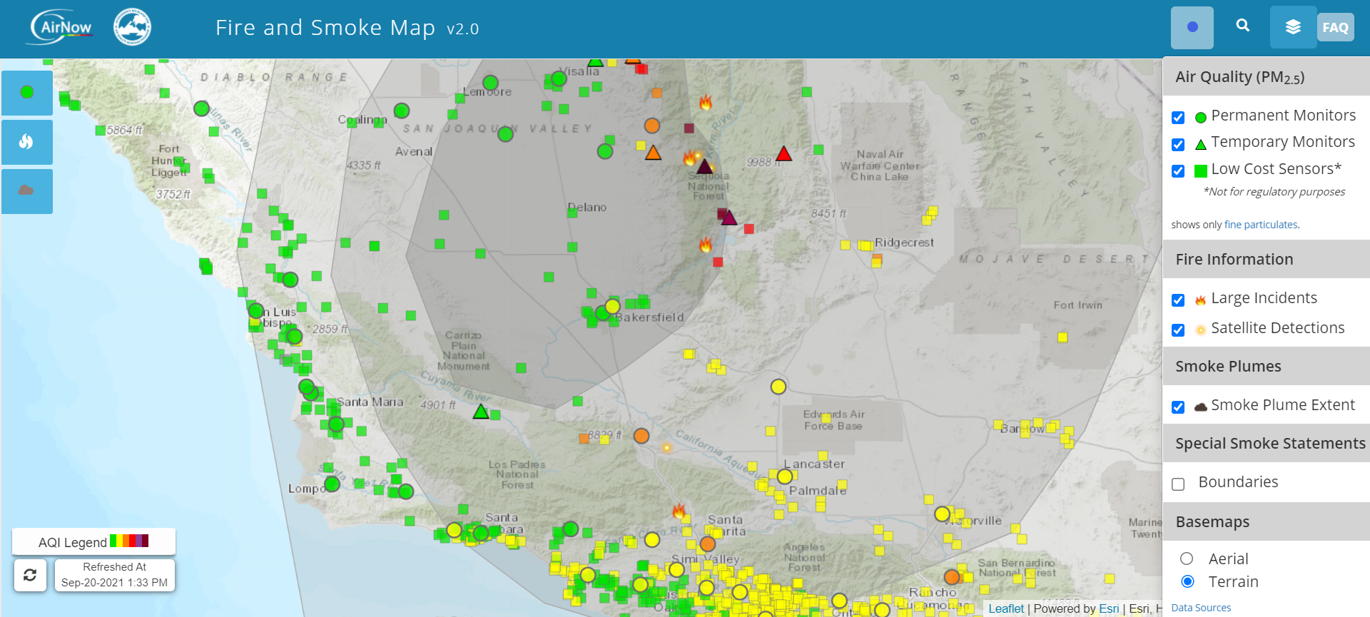
How to Read the Map
The map has a “layers” function in the upper right hand corner that allows you to view all data at once or select the monitors, fire incidents, or smoke plumes individually. Permanent monitors are shown as circles, temporary monitors as triangles, and PurpleAir’s low cost sensors as squares.
Large incidents are shown as fire icons and satellite detections of fires are the small glowing circles. The color of the monitors and sensors reflect the AQI they are reporting. There is also a refresh button in the bottom left hand corner of the screen that allows you to update the map to show more recent readings from the monitors.
More Detailed, Location-Specific Information
Clicking on one of the monitors/sensors in a location provides detailed information about the AQI, recommendations for those in the area, and projected trends.
For example, the screenshots from the website below indicate that as of 1 p.m. PT on September 20, 2021 in Kernville, a temporary monitor is reporting an AQI of 288 or very unhealthy.
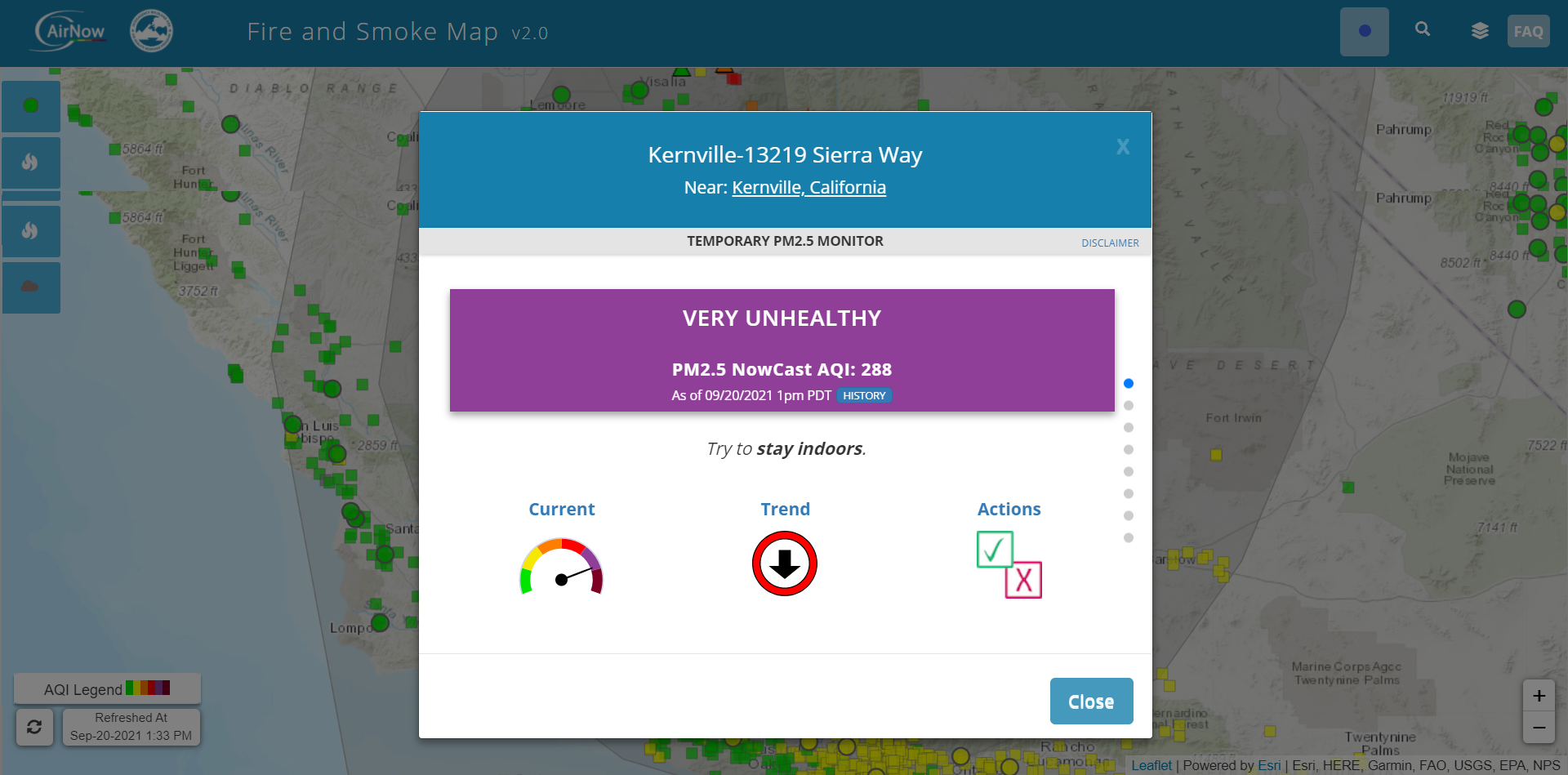
Everyone is recommended to limit outdoor activity and sensitive groups are advised to avoid all outdoor activities.

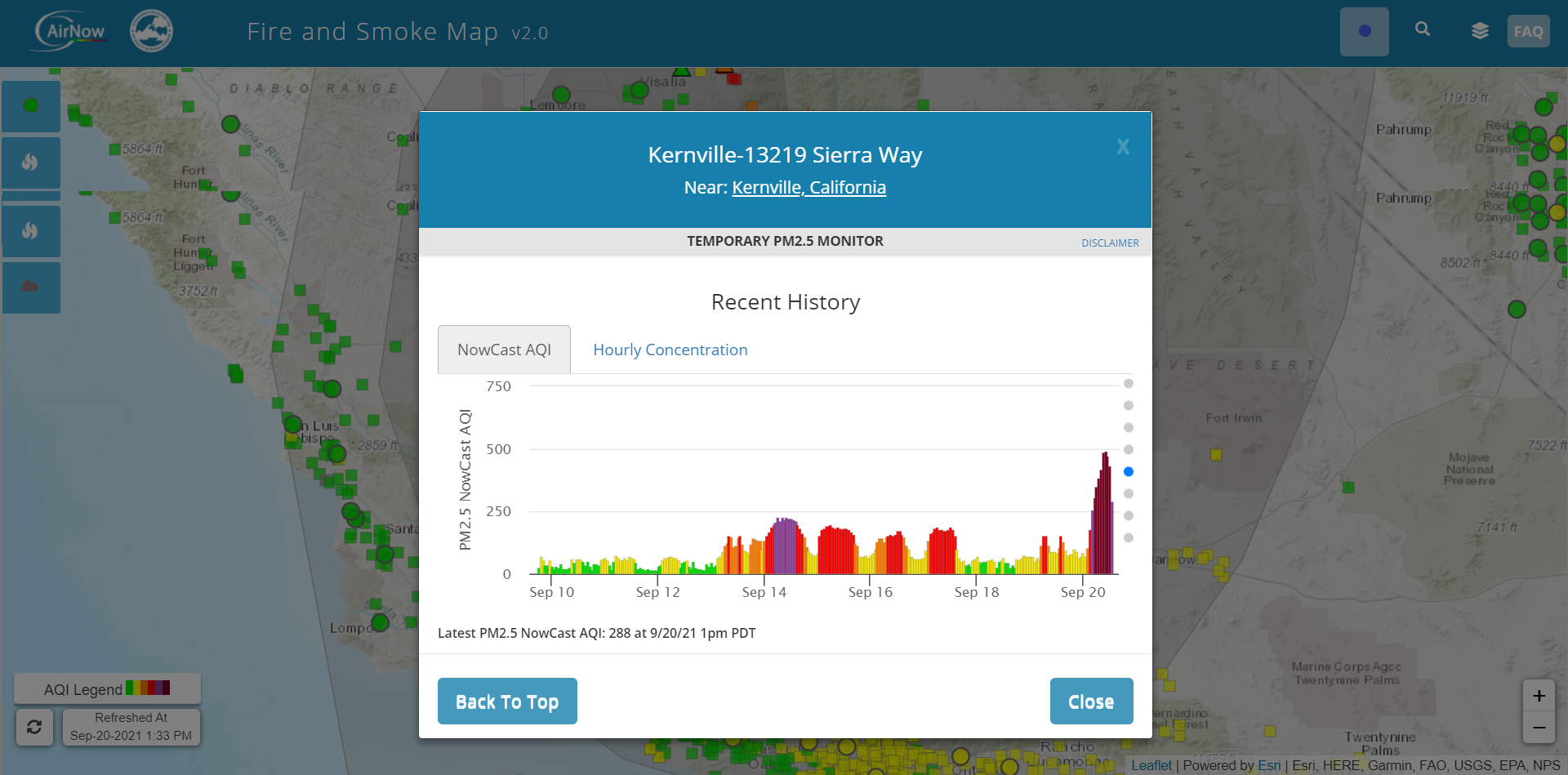
Users can also access the history of that sensor’s AQI reading for that location.
Important Considerations
The site does provide a disclaimer indicating that monitor data can be influenced by wind speed, terrain, smoke plumes, or other pollutants, like ozone. It’s important to take this into consideration as well as monitor readings from the surrounding areas to get an overall picture of the air quality in a region at any given time.